Santander
Helping Santander grow with brand campaigns, TV adverts, online design, digital experience, social content and more.
Creative Ideation / Brand Campaigns / TV Ads / Art Direction / Copywriting / Digital Design / Social Media Design / Brand Guidelines / Photography
The goal
As one of the UK's largest banks, serving millions, Santander continually strives to deliver industry-leading services, communications, and campaigns. I collaborated with their team during a period of significant growth, contributing to projects across the entire business.




Santander Cycles
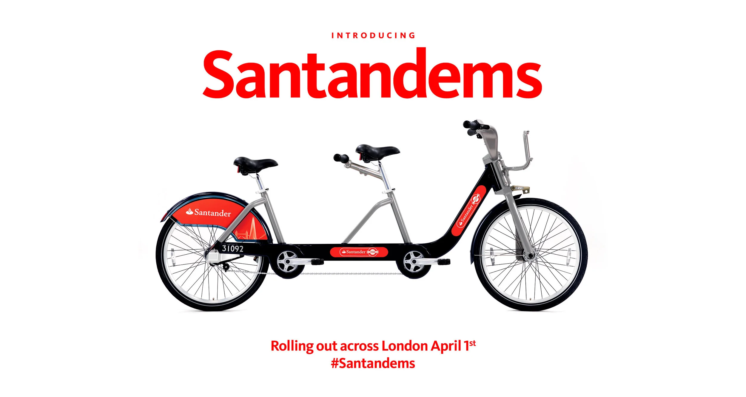
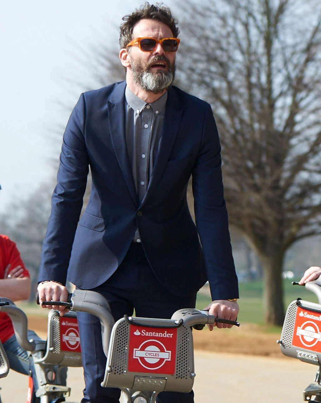
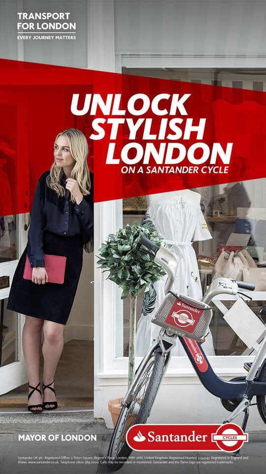
Santander won the pitch to become TfL's official sponsor for the docking bike scheme. Previously known for their Barclays blue branding, it was our job to give the bikes a new name, identity, graphic design style, online design system, and advertising guidelines. I also contributed to the creation of Santander Cycles campaigns, which included online films, social content, and out-of-home advertising.


Campaigns
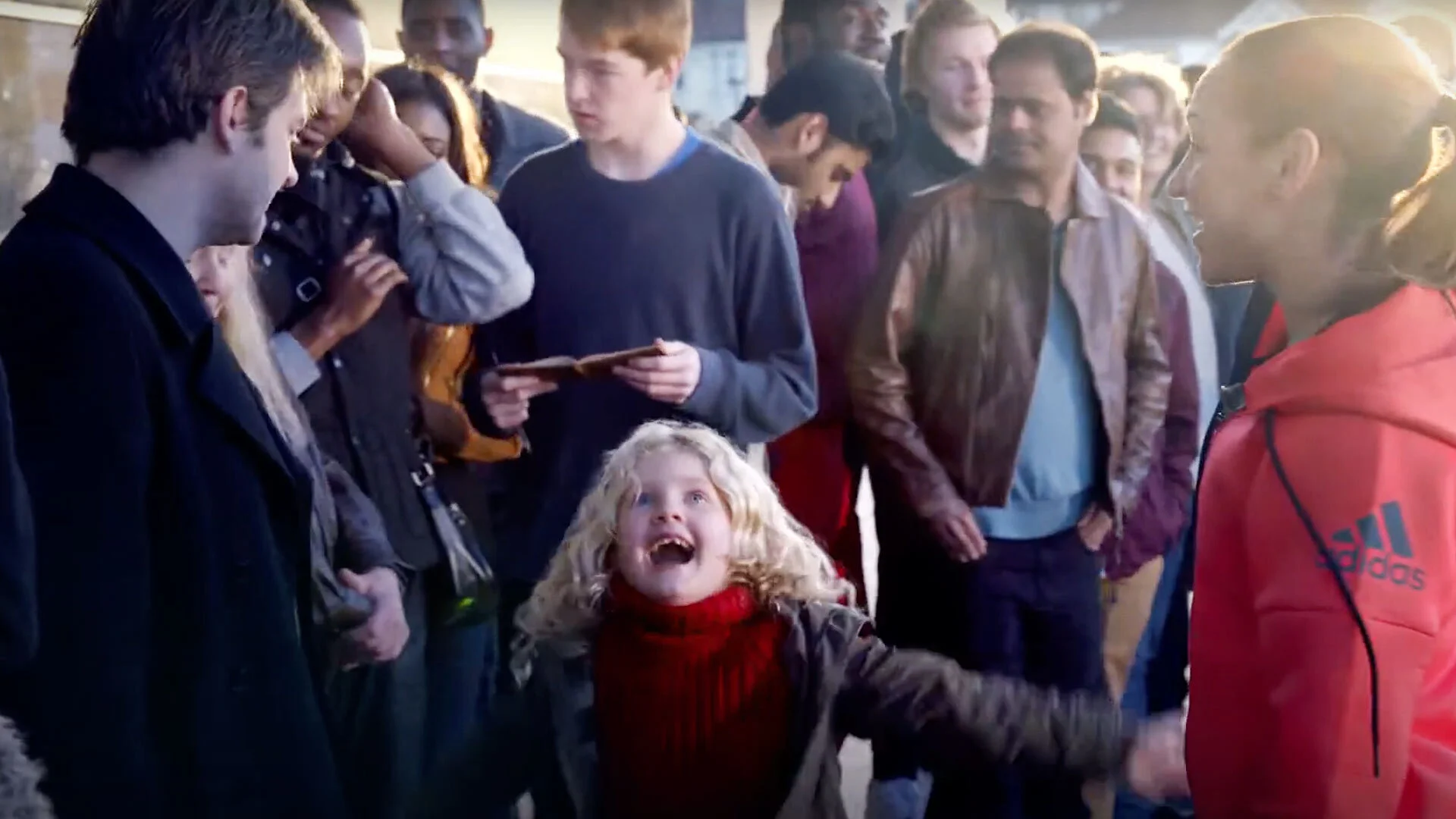
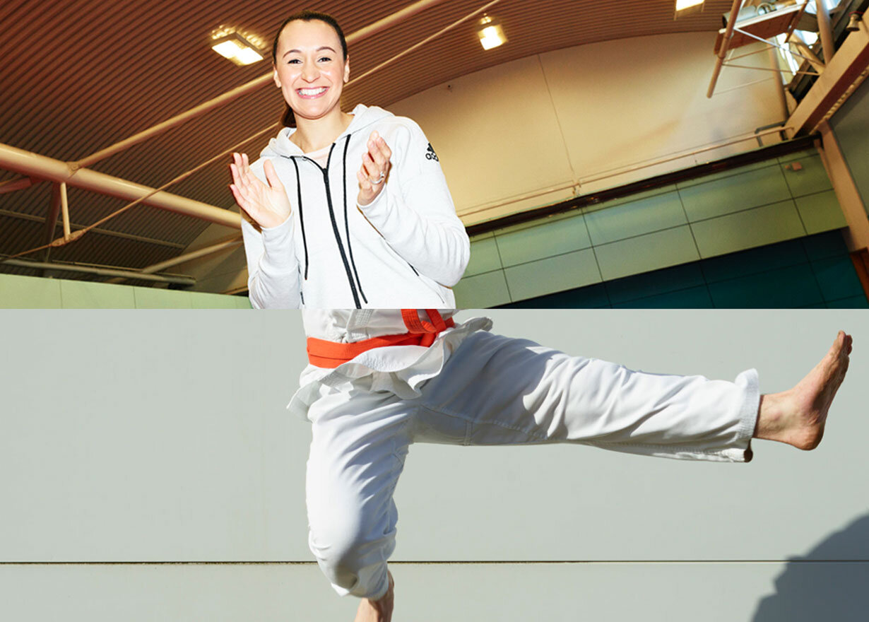
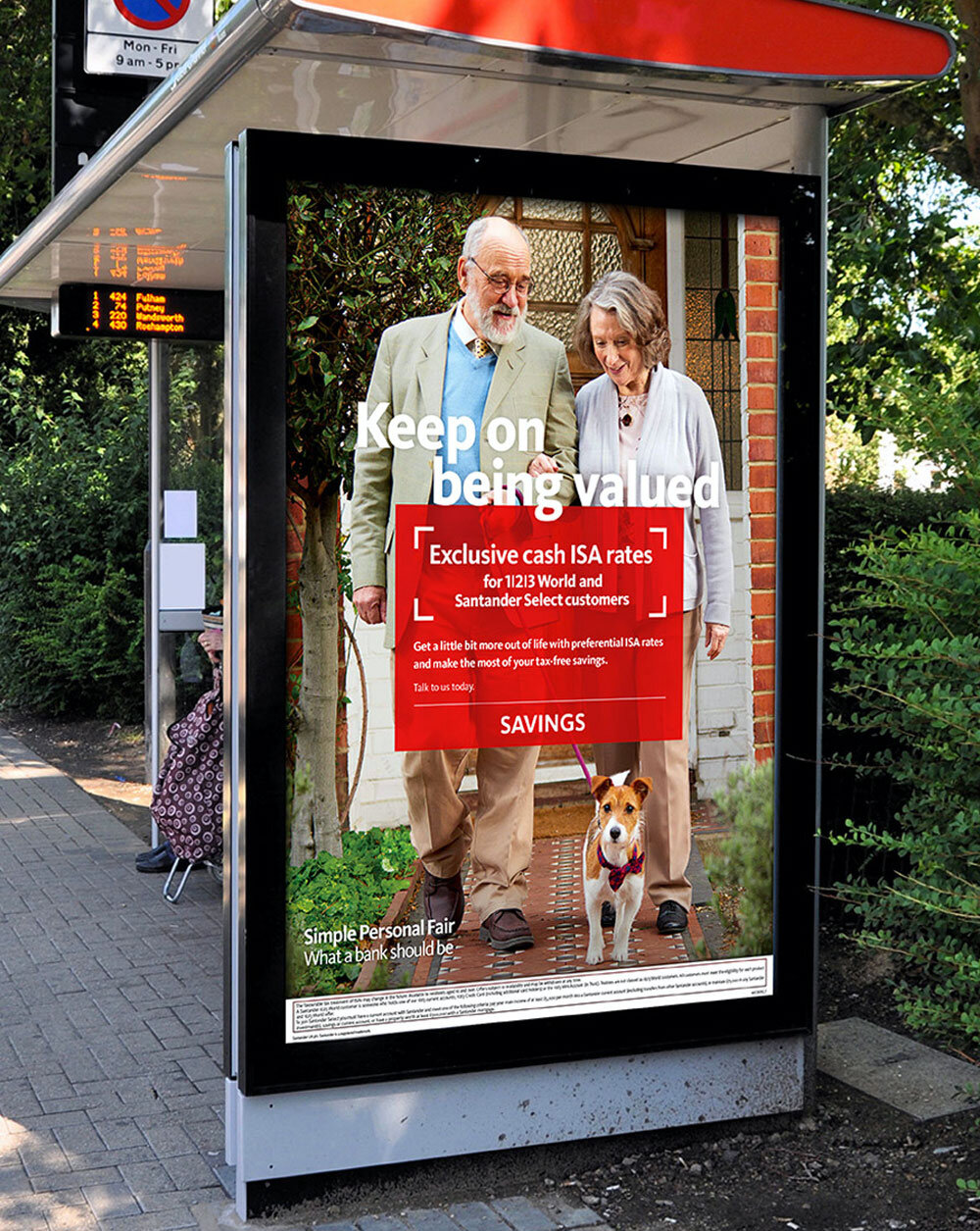
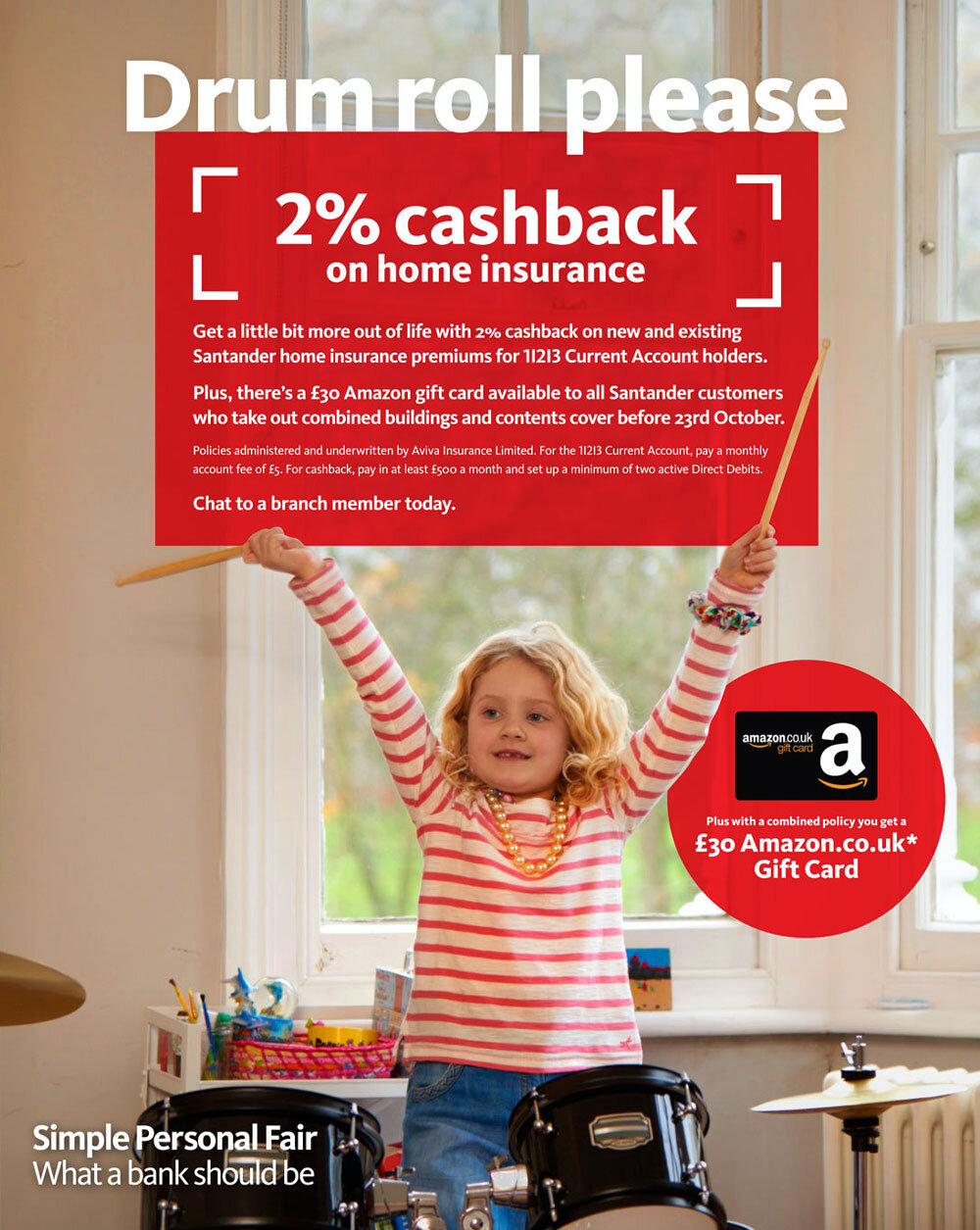
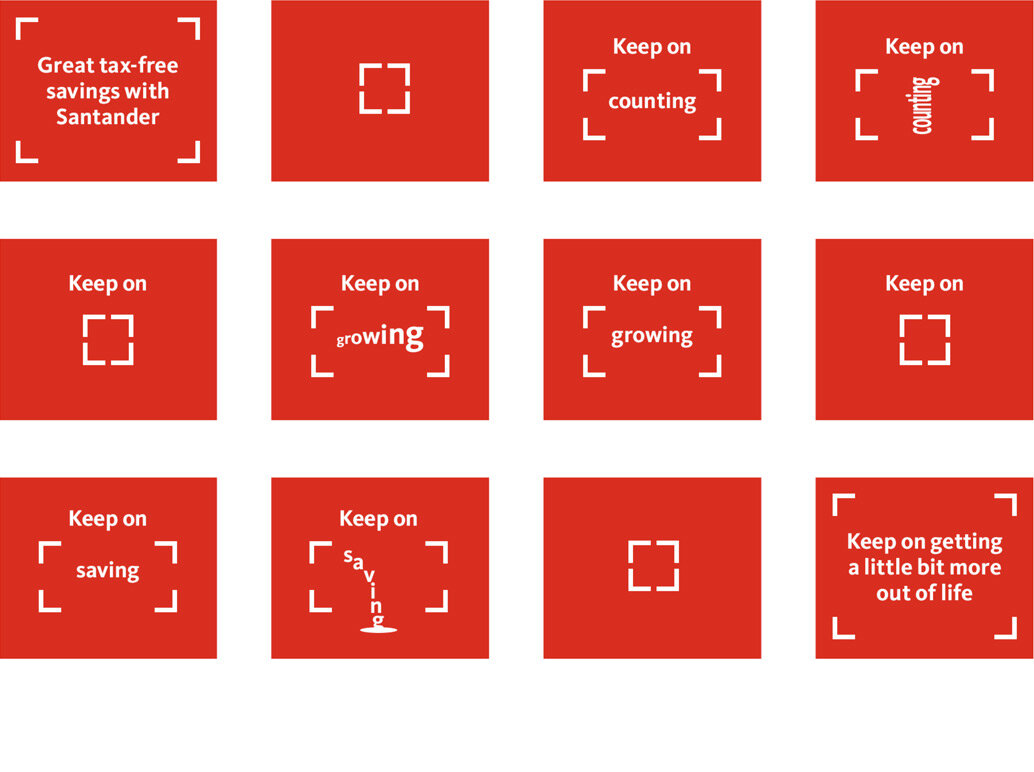
I’ve worked on multichannel campaigns for Santander, where I wrote TV ads and press headlines, led print and digital design teams, and developed concepts for digital, social, and out-of-home advertising. I also art-directed lifestyle and celebrity talent photoshoots. The 'Keep on' campaign achieved record sign-ups, making it the most successful campaign since the launch of the 1|2|3 account.


Ruby TV advert directed by Joanna Bailey


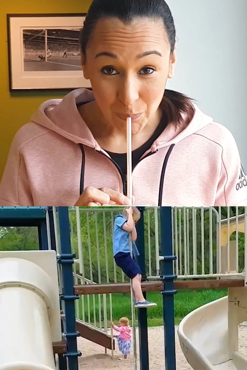
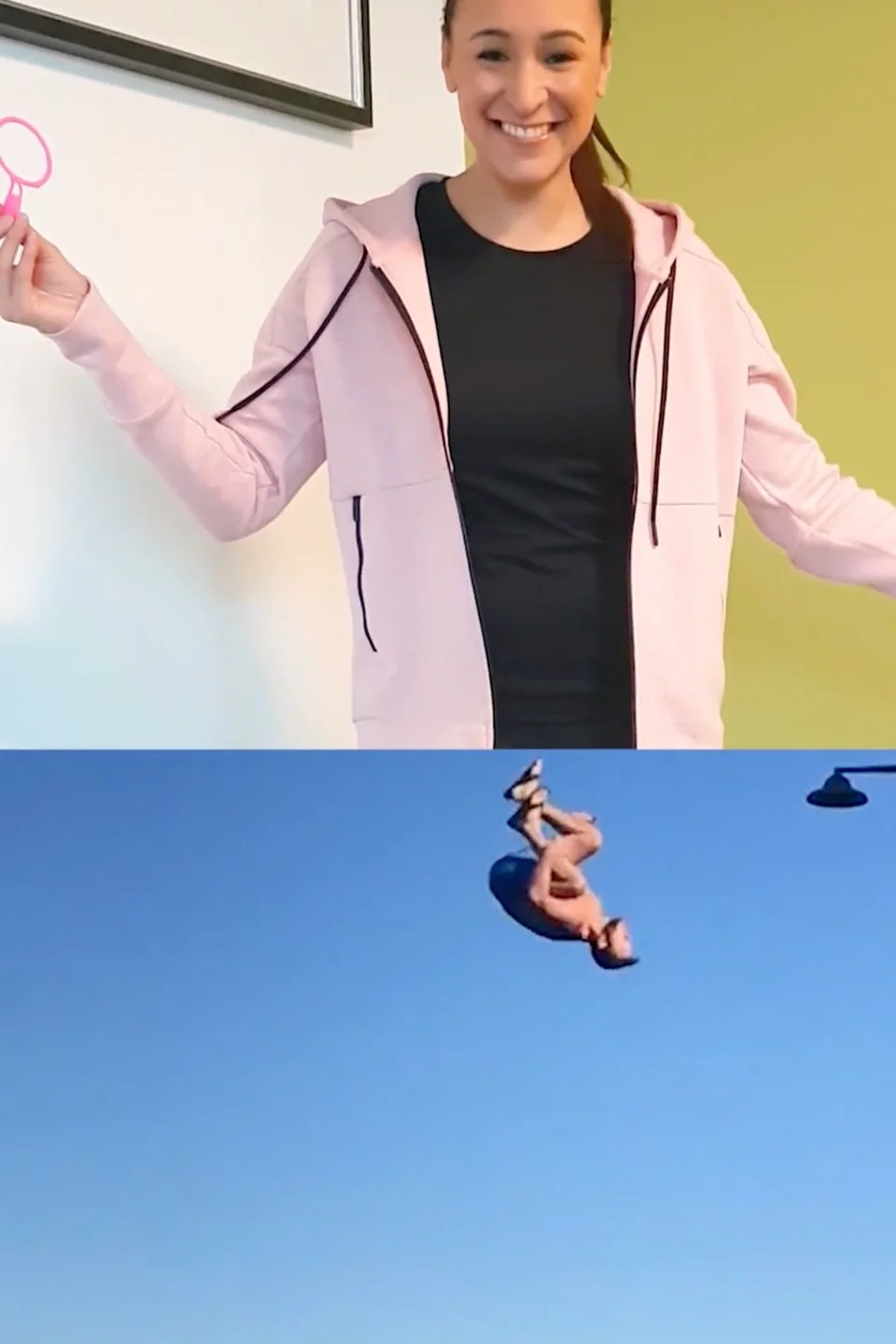
Investments social advert
Investments social advert
Design system
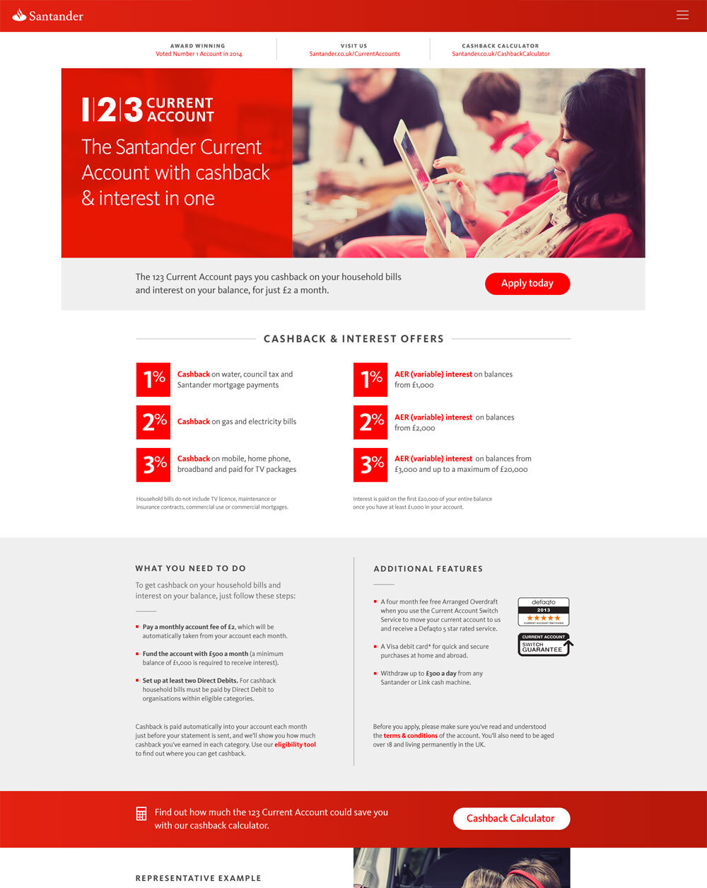
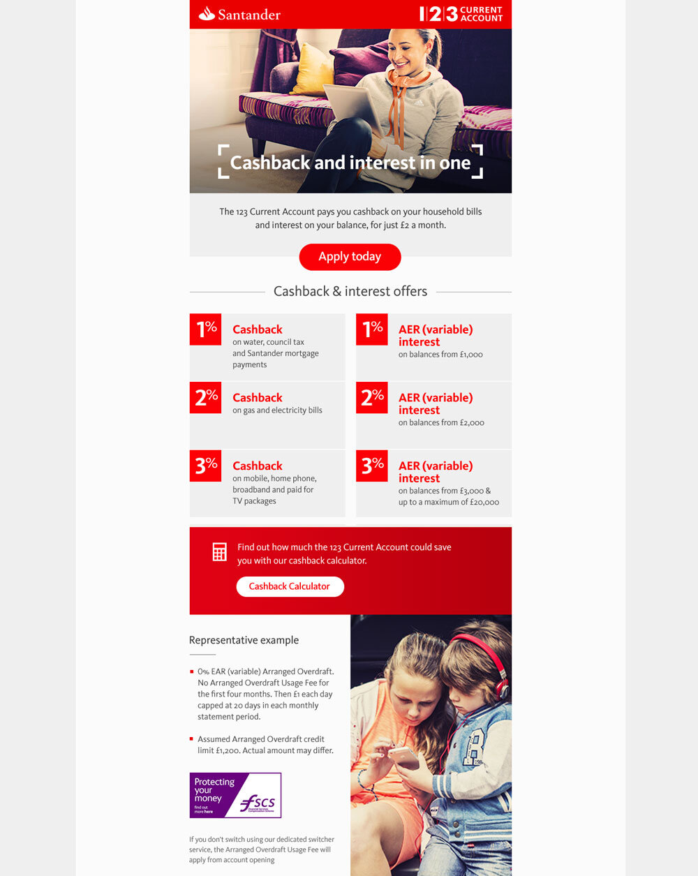
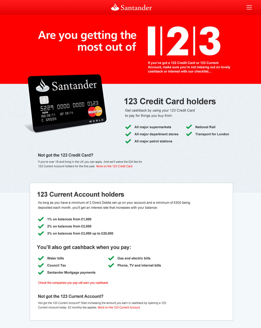
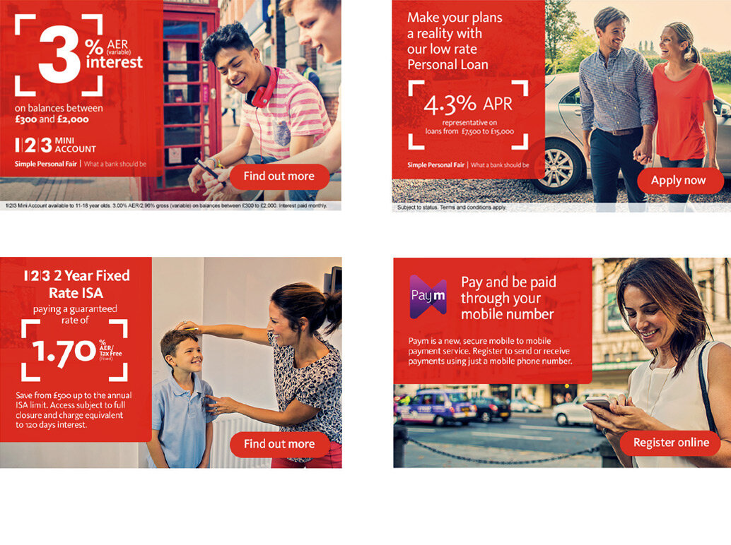
When Santander acquired Abbey National, they inherited a vast number of legacy web pages and a fragmented design system. It was my responsibility to lead the design team in creating a unified brand design system for use across websites, emails, online banners, and print. This system was then adopted by multiple teams and agencies.

The logo
In 2010, Abbey, Alliance & Leicester, and Bradford & Bingley rebranded as Santander UK, adopting the Spanish logo that had been in use since 1986. While the logo remained largely unchanged, subtle modifications and a font update were made in 2020. Despite this, the public still struggled to identify the logo’s meaning.
Santander tasked us with bringing the iconic flame logo to life through animation for the first time in its 33-year history. Collaborating with The Mill and DBGG, we explored a wide range of options and techniques, from 2D and 3D approaches to experimenting with different colours and animation styles.


The brand new Santander logo animation
Lockdown
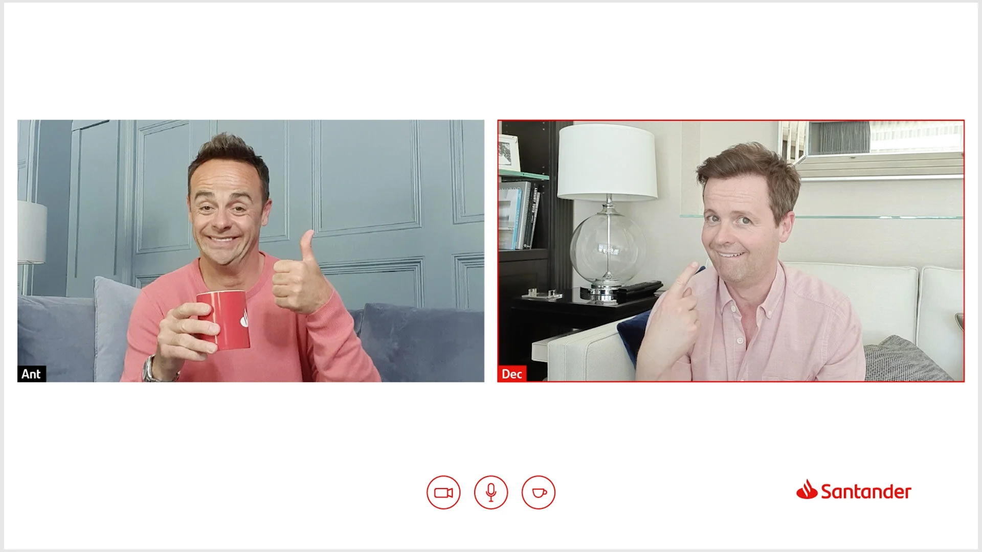
During lockdown, loneliness among the elderly surged as many were forced to isolate from family and friends. With Santander branch staff unable to work due to closures, we had an idea: we invited Santander employees to connect with elderly customers for a virtual cup of tea and a weekly chat. To promote the initiative, we enlisted brand ambassadors Ant and Dec, creating a film that explained how it all worked—over a virtual cuppa, of course.
Quarantea directed by Chris Faith


